Using Reports to Determine Product Usage Statistics
After Meeting Insights is integrated with Microsoft's Power Business Intelligence (BI), administrators and/or management can create business analytics reports showing how and to what extent users in the enterprise are engaging with Meeting Insights and its features.
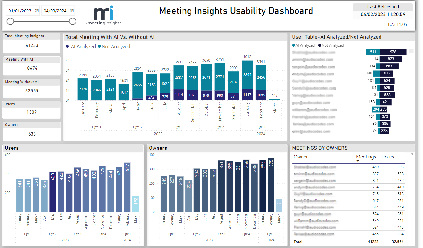
The figure below shows a Usability Dashboard report.
|
●
|
The Usability Dashboard report can give administrators and/or management an indication of the value proposition of Meeting Insights and its key feature, AI. |
|
●
|
The report's statistics and graphs show admin the extent to which and the depth at which users are using the application and its key feature, AI. |
|
●
|
The report is generated in an admin-friendly Microsoft Power BI template. |
[Refer to the preceding figure] Admin can assess at a glance how many meetings with Meeting Insights in total were held in the enterprise over a period of time defined in the uppermost left corner of the page. Admin can moreover assess how many of those meetings were analyzed using AI, versus how many were not. Admin can quickly see furthermore how many analyses were run by users after meetings, versus how many analyses were run by owners.
Admin can view these statistics per user in the User Table-AI Analyzed/Not Analyzed pane on the right side of the page. The pane presents an ordered list of users, the # of meetings each user had in the defined period, and the # of hours each user spent in meetings.
The Meetings by Owners pane below it presents how many meetings each owner held and how many hours each owner spent in meetings. The pane also shows the total # of meetings held by all owners and the total # of hours that were spent in meetings by all owners.
The figure below shows a Meetings report.
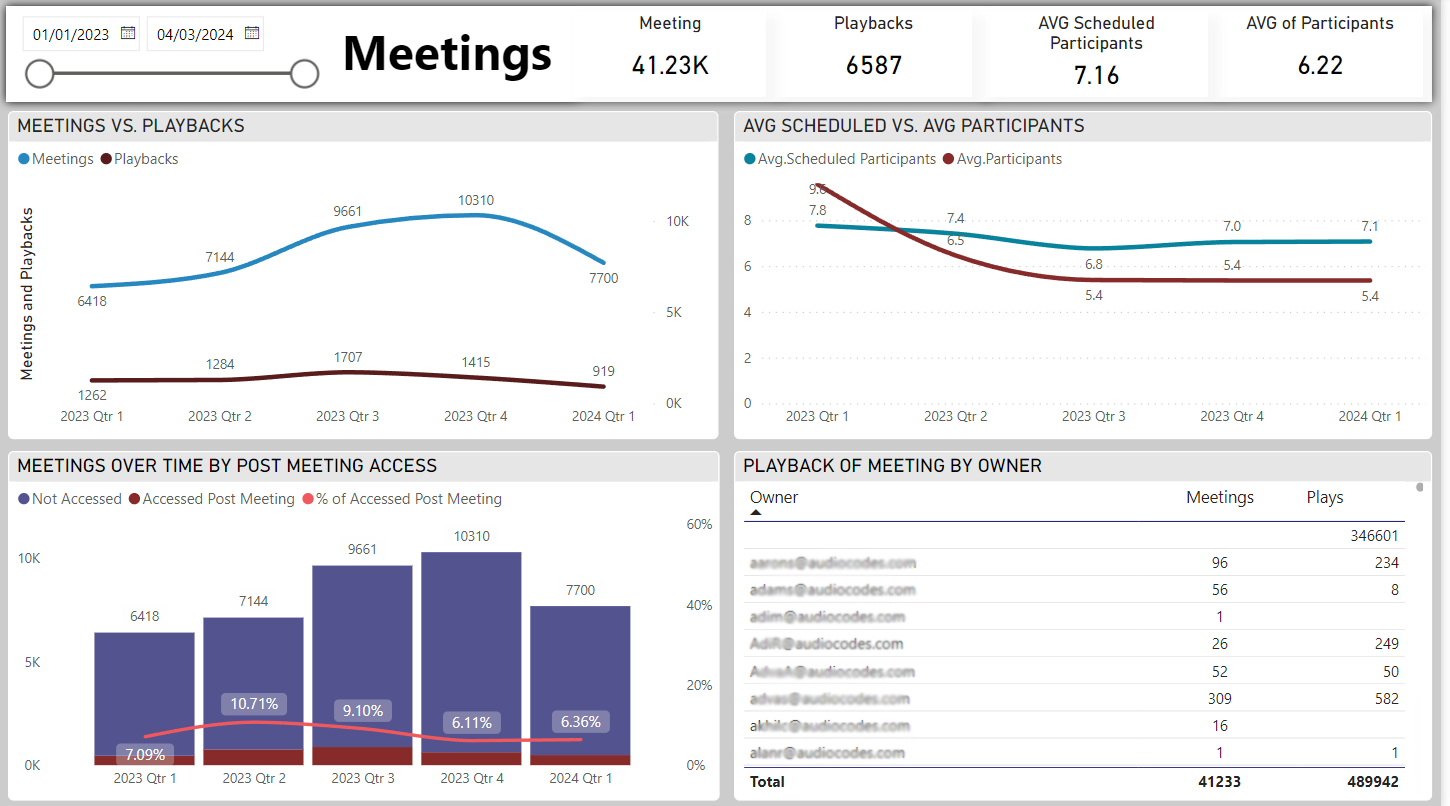
[Refer to the preceding figure] Admin can quickly gauge the depth at which users | owners engaged with the product over a period of time defined in the uppermost left corner of the page. The Meetings vs. Playbacks graph shows the # of meetings that were held in the organization vs. the # of playbacks that were run. If, for example, the playback feature was hardly taken advantage of (indicated by a significant gap between the Meetings and Playbacks curves as shown in the graph in the preceding figure), this can indicate that users | owners tend to use the product superficially, without playing back meetings. If, by contrast, the playback feature was taken maximum advantage of (the two curves both show high usage), it indicates that users | owners took good advantage of it. The graph therefore demonstrates feature effectiveness.
The Average Scheduled vs. Average Participants
graph shows the # of invitees that were invited to meetings vs. the # of invitees that actively participated in those meetings. These statistics demonstrate product effectiveness, helping administrators and/or management assess whether they're getting a return (usage) from their investment.
The graph Meetings over Time by Post Meeting Access shows admin the # and % of users who accessed recordings of meetings after they ended, over time. This graph too demonstrates product effectiveness and the extent to which users are taking advantage of Meeting Insights' features.
The graph Playback of Meeting by Owner shows the extent to which Meeting Insight's playback feature was taken advantage of by meeting owners. The graph shows the behavior per owner as well all owners in total. Admin can at a glance determine:
|
■
|
the # of owners vs. the # of playbacks run by them
|
|
■
|
the # of meetings each owner had vs. the # of playbacks run by each |
The figure below shows an AI Summary report.
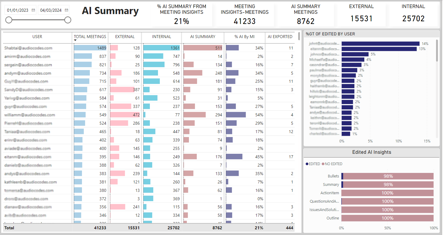
[Refer to the preceding figure] Admin can use this report to quickly determine AI Summary usage globally and per external | internal user, over a period of time. The report can give administrators and/or management an indication of the benefit Meeting Insights' AI Summary feature is providing the organization.
The report's title bar enables admin to quickly determine global statistics for AI Summary (from l-r):
|
■
|
% AI Summary from Meeting Insights shows the % of meetings in which the AI Summary feature was used. In the preceding example, the AI Summary feature was used in 21% of all meetings held during the period. |
|
■
|
Meeting Insights - Meetings shows how many Meeting Insights meetings were held over the period. In the preceding example, 41233 meetings were held. |
|
■
|
AI Summary Meetings shows for how many Meeting Insights meetings the AI Summary feature was used. In the preceding example, the feature was used for 8762 meetings. |
|
■
|
External shows the # of external meetings each user had with Meeting Insights over the period. In the preceding example, all users had 15531 external meetings with Meeting Insights. |
|
■
|
Internal shows the # of internal meetings each user had with Meeting Insights over the period. In the preceding example, all users had 25702 internal meetings with Meeting Insights. |
The report's main pane enables admin to determine AI Summary usage statistics per user in the following columns (from l-r):
|
■
|
Total Meetings shows the total # of meetings each user had with Meeting Insights over the period. The column can be ordered from most meetings to least meetings, or from least to most. Admin can easily determine which user in the organization had the most meetings using Meeting Insights, and who had the least. |
|
■
|
External shows the # ofexternal meetings the user had with Meeting Insights. The column can be ordered from most to least, or from least to most. Admin can easily determine which user had the most external meetings with Meeting Insights, and which user had the least. |
|
■
|
Internal shows the # ofinternal meetings the user had with Meeting Insights. The column can be ordered from most to least, or from least to most. Admin can easily determine which user had the most internal meetings, and which user the least. |
|
■
|
AI Summary shows the # of meetings for which AI was triggered (relative to the total # of meetings that were held over the period). |
|
■
|
% AI by MI shows the % of meetings for which an AI Summary was generated, per user. Admin can use the statistic to determine the extent to which each user used the feature over the period. |
|
■
|
AI Exported shows how many times AI was exported over the period by anyone who had access. |
|
●
|
Each column also displays global usage. |
|
✔
|
% AI by MI column displays the total percentage. |
|
✔
|
All other columns display the total number. |
The report's %GT of Edited by User pane enables admin to determine per user the % of edits they performed relative to the number of meetings they had. This too can serve as an indication of the:
|
■
|
extent to which and depth at which each user is engaging with the app's edit feature |
|
■
|
app's value proposition in terms of the edit feature |
|
■
|
app's ROI in terms of the edit feature |
|
■
|
benefit the organization is deriving from the service |
The report's Edited AI Insights pane enables admin to determine editing patterns. In the preceding example, 2% of edits were made on bullets and 2% on the summary. Action Items, for example, were not edited at all. These patterns too can serve as an indication of the:
|
■
|
extent to which and depth at which users are engaging with the app |
|
■
|
app's value proposition |
|
■
|
benefit the organization derives from the service |